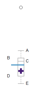
Box plots show the relationship among multiple data points without making any assumptions of the underlying data. The box plot is a quick way of examining one or more sets of data graphically.
- Point A
- Represents the boundary of the upper inter-quartile range (defined as 1.5 * the top quartile)
- Point B
- Represents the boundary of the upper quartile (75%)
- Point C
- Represents the median
- Point D
- Represents the boundary of the lower quartile (25%)
- Point E
- Represents the boundary of the lower inter-quartile range (defined as 1.5 * lower quartile)
- Circles above top whisker or below bottom whisker
- These are outliers. Any data that is outside the inter-quartile range is an outlier. Outliers may appear above or below the box and whiskers
- Purple cross
- ACU's value
- Thin Blue Line
- Represents a comparison across all values:
- Faculty Salaries: CUPA Median
- Colored Circle
- This represents two values:
- The vertical position relates the textbox value to the marketplace
- The color represents the estimated effort to achieve the outcome
For more information see: Box Plots
